Anchorage Airport | Rebranding
Ted Stevens Anchorage International Airport approached MSI to embark on a rebranding journey. Together, our goals included simplifying the airport’s tongue-twisting name, designing a mark that was bold, recognizable and reflective of the airport’s global cargo potential, and develop their brand into something that was flexible and spoke to their dual audiences.
Our Role
CopywritingGraphic DesignIdentity DesignLogo DevelopmentWebsite Development

Logo Development
In the course of our research we found airports were dropping their formal names in favor of their three-letter air code – ANC in the case of Ted Stevens. In the end, the client selected a bold, modern mark with the silhouette of a four-engine, 747 wide-body cargo airplane embedded in the ‘C’.
Visual System
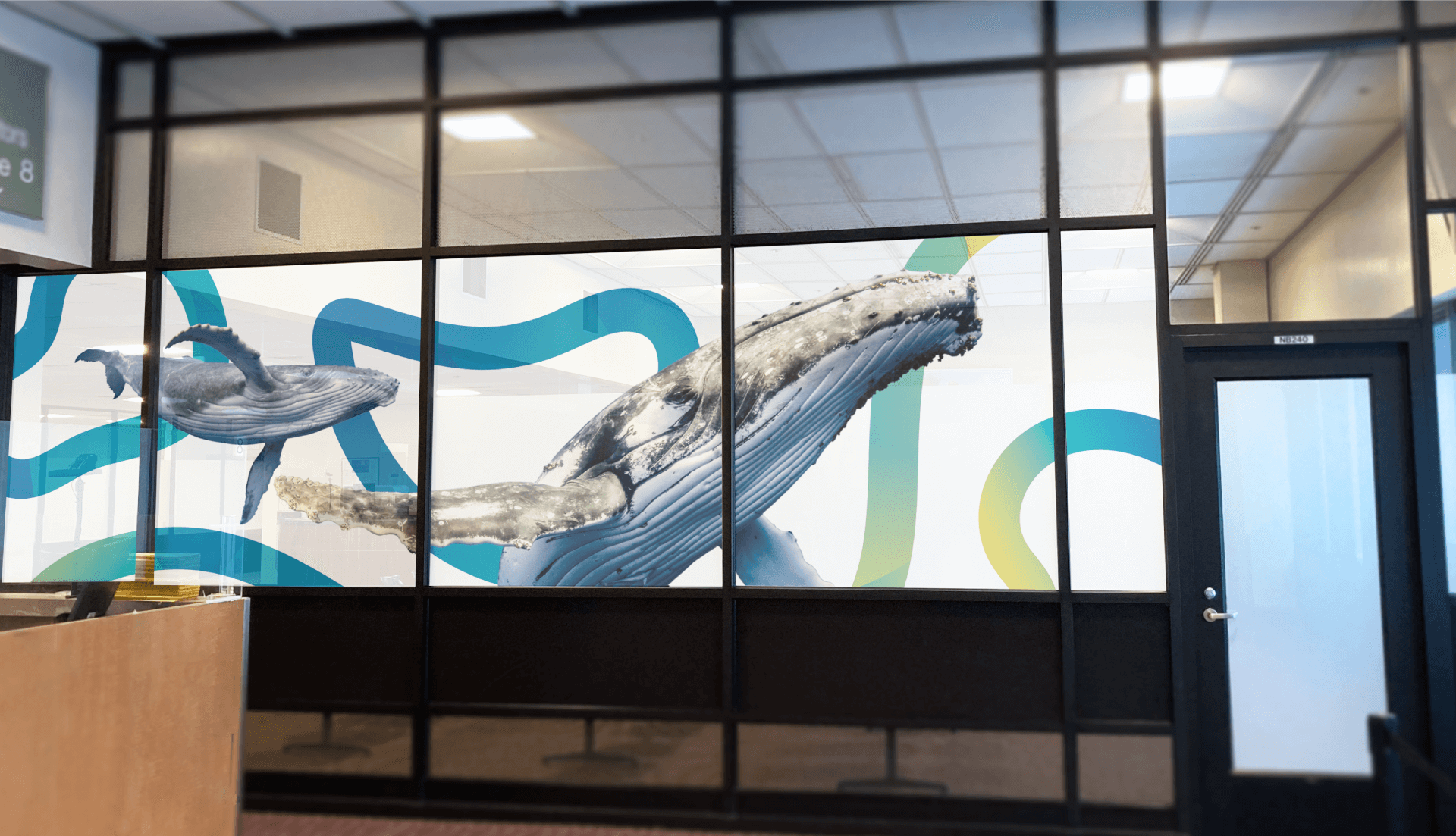
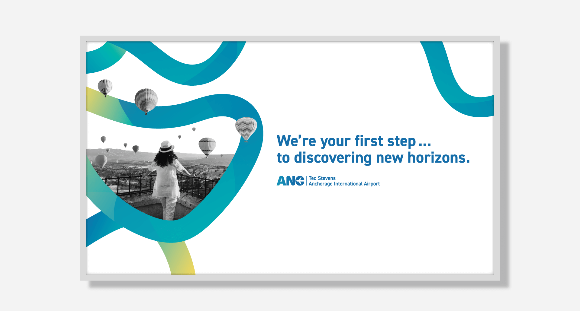
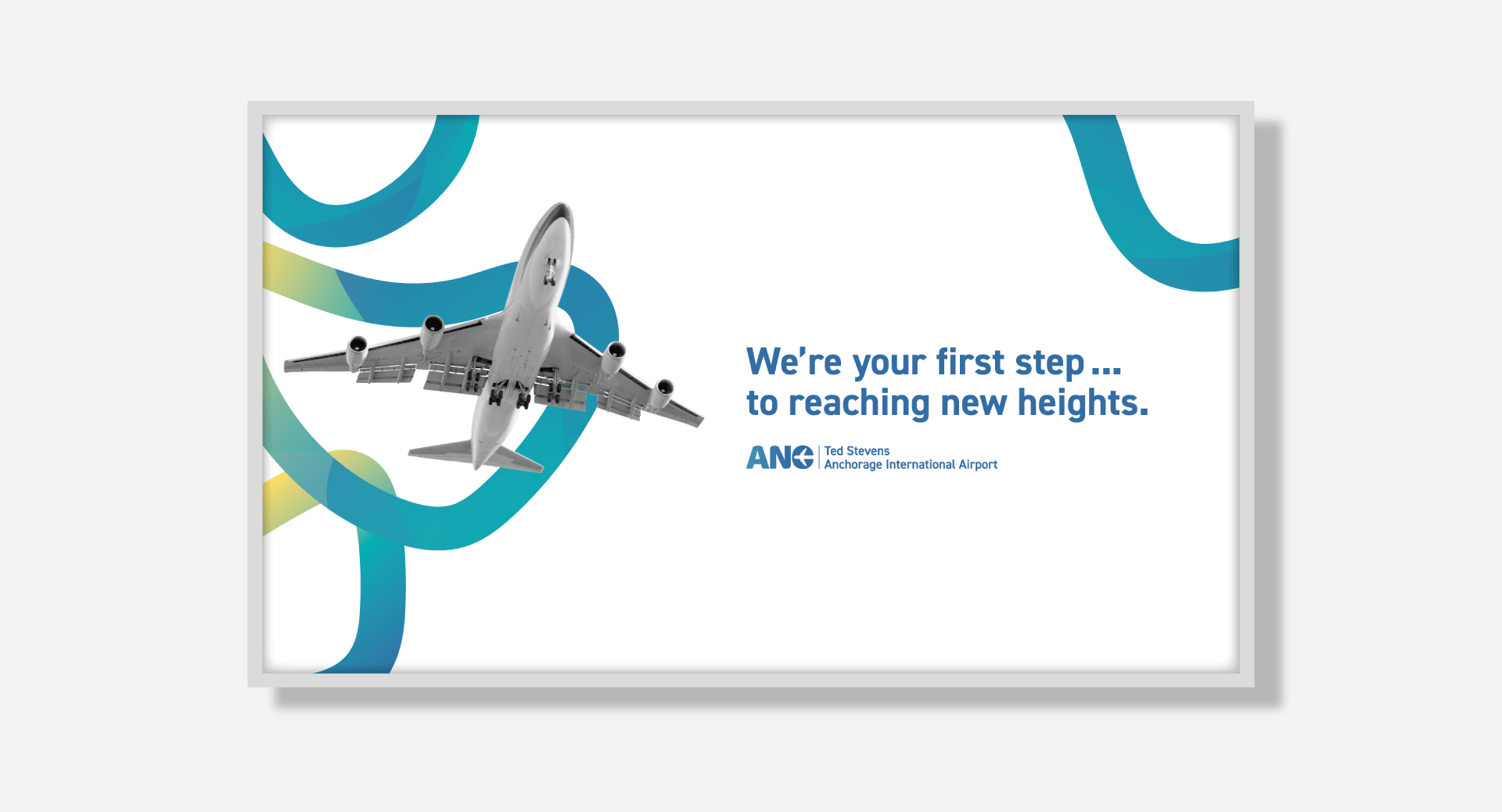
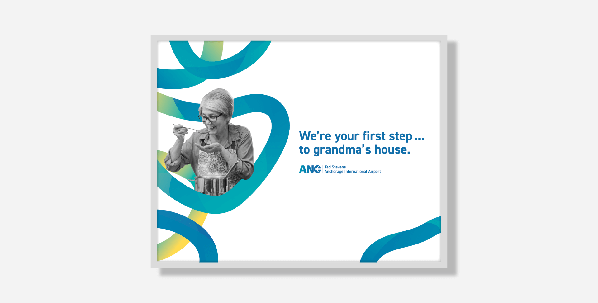
After the completion of the logo, we set our sights on completing the full visual system for the ANC. This system had two primary audiences: businesses and passengers. During development, it was decided that this required two separate, yet complimentary styles. The business voice of the airport is represented with bright blues containing sweeping, soft gradients, representative of the wind and ANC’s subarctic location. The passenger visuals also contain sweeping curves, but isolated and more colorful. Photography interacts with the colorful gradient linework, providing a flexible visual system for all the environmental graphics throughout the airport.